✧ PROCESS ✧
My Role
Principal UX designer
Timeframe
Completed in 3 months
Deliverables
Desktop designs and Tableau guidelines
Methods
1:1 & group Interviews. Participatory design. Personas. Discovery & validational research.
✧ PROBLEM ✧
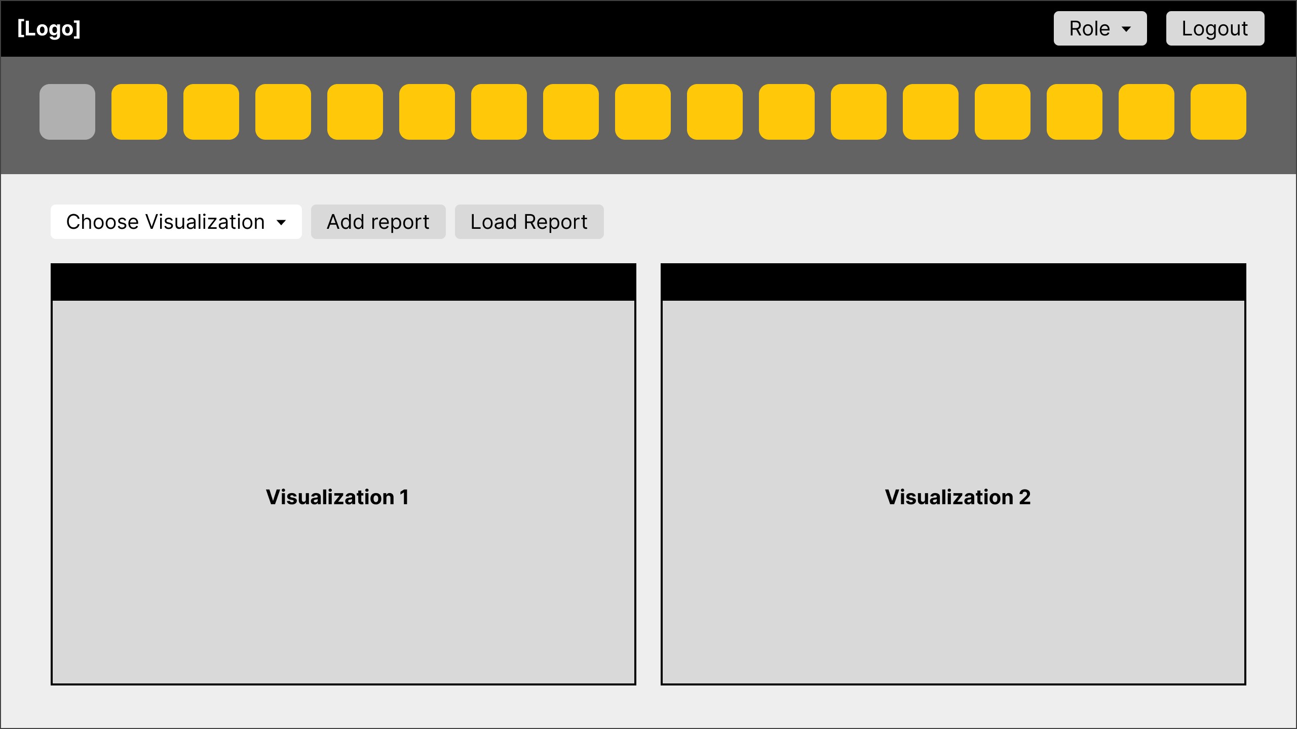
Completely being bypassed by most users, the original system was viewed as superfluous and a hinderance to their workflow.
The portal was meant to function as a jumping point, allowing users to quickly dive into different applications and tasks.
This image is a recreation of the original system screen in compliance with my NDA
Redesign the aircraft maintenance dashboard to surface key information for maintainers
Allow the dashboard to be customizable to different user roles at different levels in the chain of command
Increase efficiency and output on US Air Force bases
✧ DISCOVERY ✧
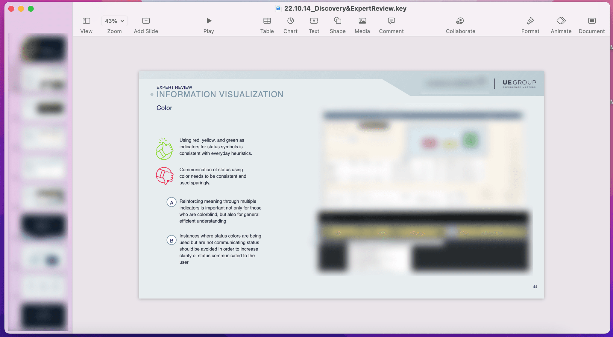
An expert review revealed that the new design would need to be dynamic, responsive, and personal to the many different users roles.
The 12 client stakeholders interviewed for the expert review described the original system as disjointed
Findings from the discovery stage were disseminated to the client in an easy-to-read format
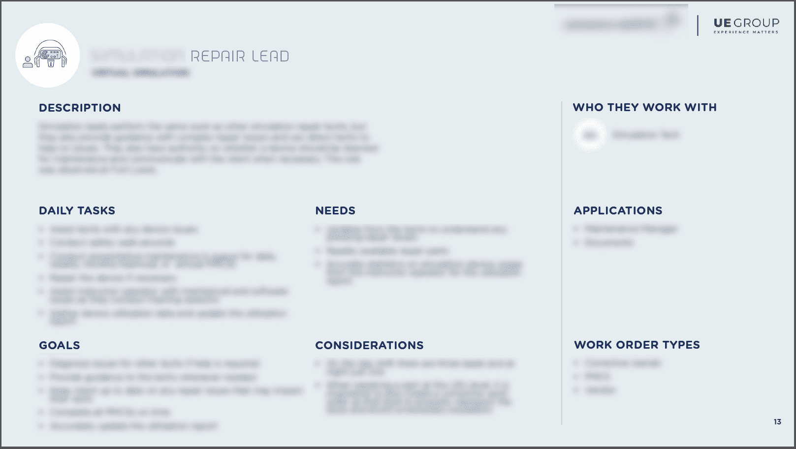
18 personas were created to represent the tasks, needs, and goals of the 46 expert users who were interviewed.
Persona cards included many confounding factors which influenced the final system
The visualizations shown on the dashboard were too generic
The portal doesn't provide a mental model of how the system ties together hierarchically.
The design & layout are outdated, obtuse, and not consistent with company branding
✧ IDEATION ✧
It was important to the team that we advocated for user needs at every stage of the design process, from concept to execution.
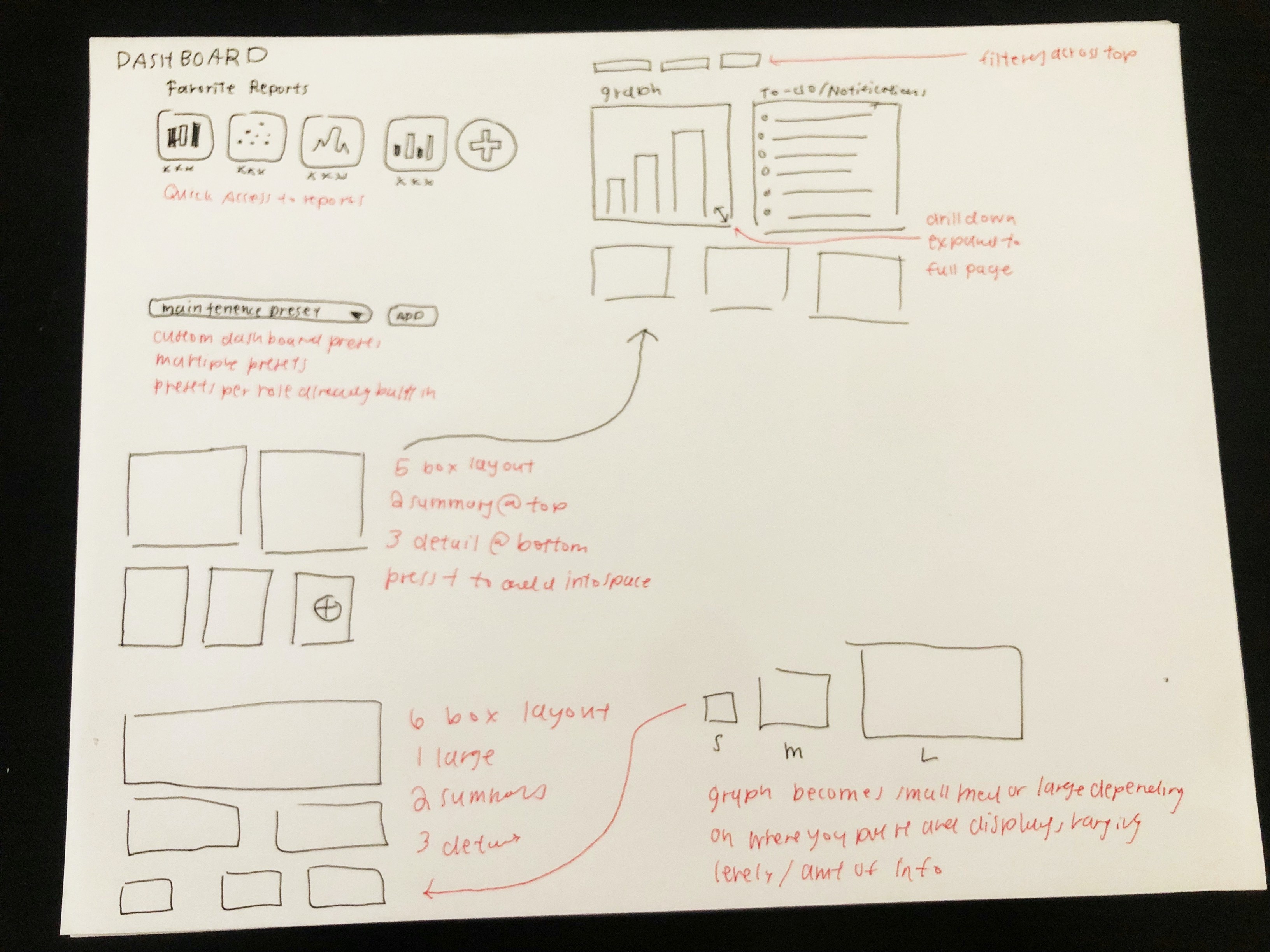
Each widget is mapped to one application, displaying differing levels of detail depending on the size of widget on the dashboard.
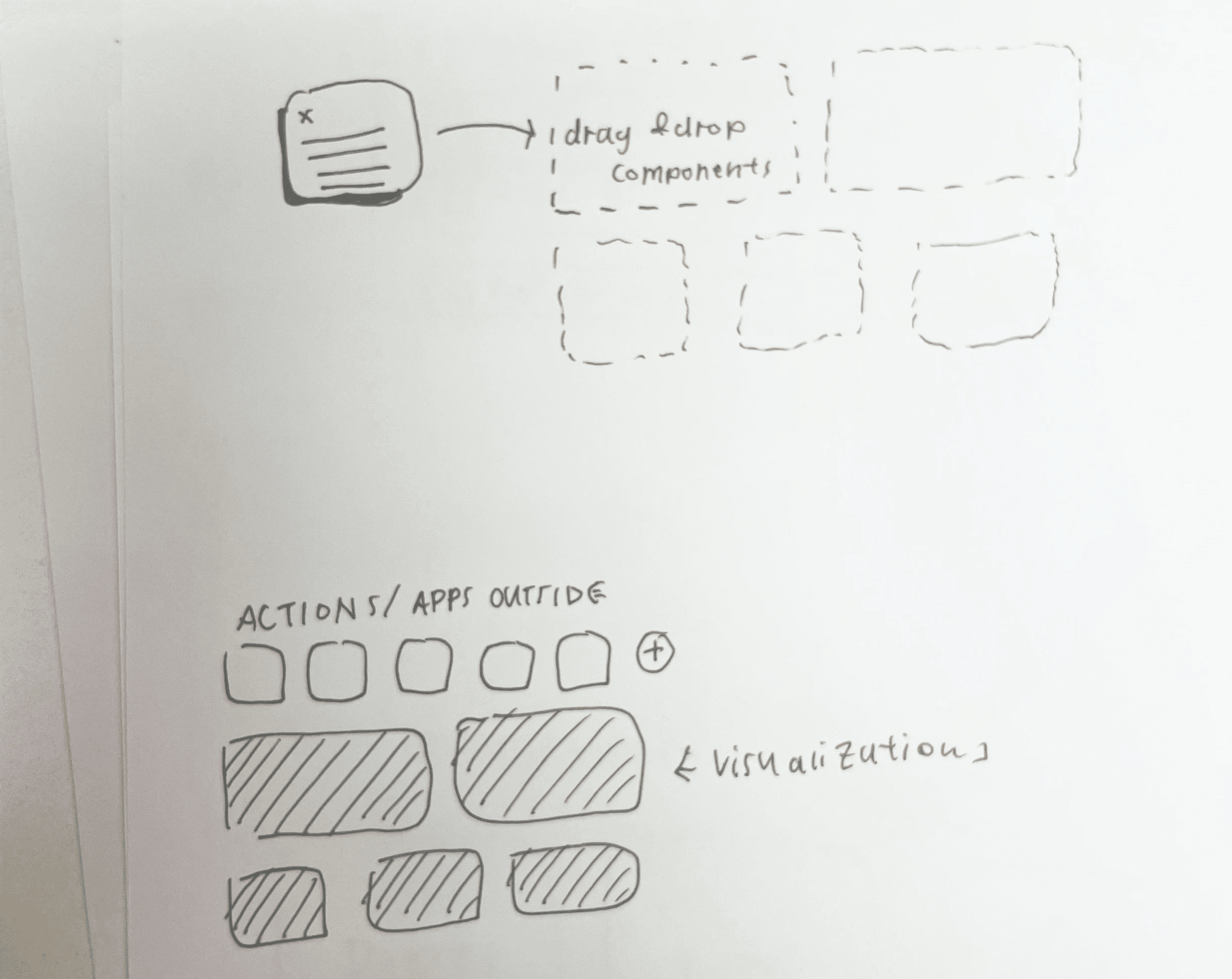
Original sketches explored various levels of customization
Pre-canned widgets would allow for multiple levels of customization, enabling a full range of effort from plug-and-play to fully personalized.
Ensuring that customization could be easily streamlined was essential
Featured a soft grid structure to accommodate personalized, flexible layouts for the variable-sized widgets
Surfacing key action items help maintainers put out the the most pressing fires when they start their day
✧ DESIGN ✧
This would allow the system to disseminates critical information and Tableau visualizations from multiple applications in an easy-to-digest format.
Example dashboards would allow users to dive right into the new portal, and serve as a starting points for developers.
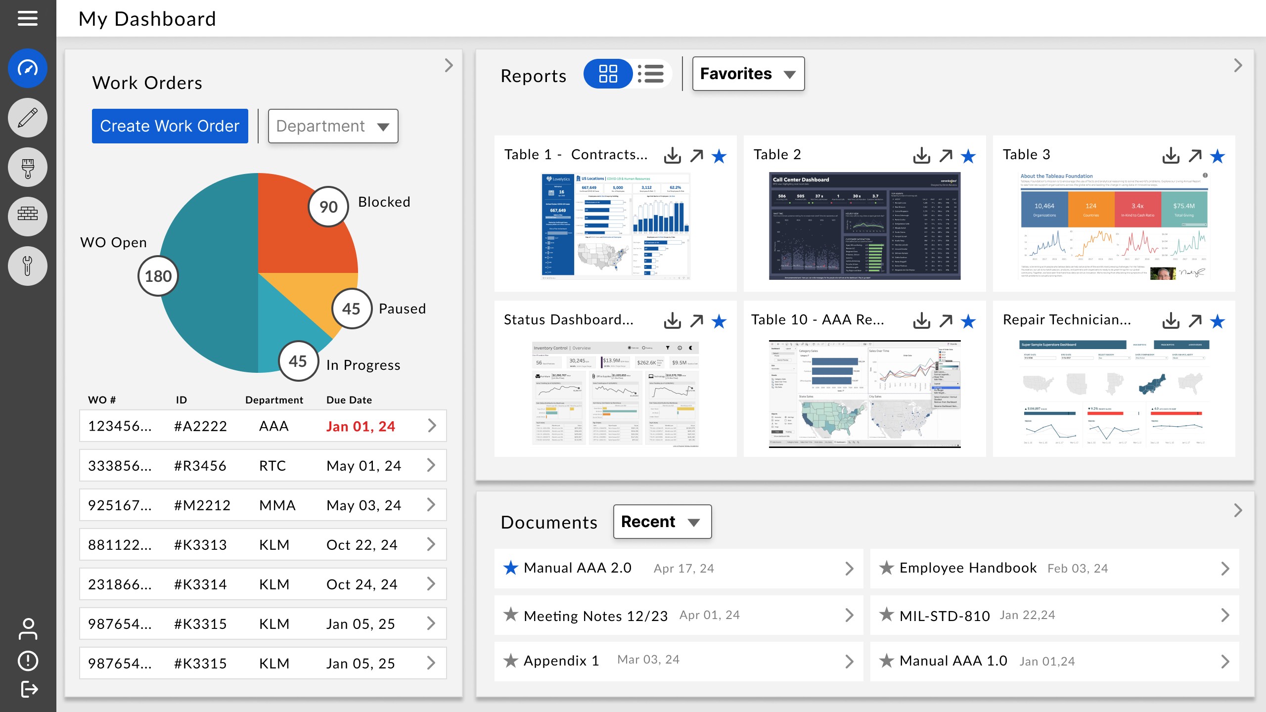
A user has the ability to start with a baseline dashboard and customize for hybrid user roles
The dashboard allows users to identify the most important fires to put out, cutting down on frustration and improving user work efficiency
Semantic color choice help bring errors to the surface, but are not the only indicator
Each widget featured a deeper level of customization, allowing users to even further fine-tune their dashboard by choosing specific pieces of information within their graphs and charts
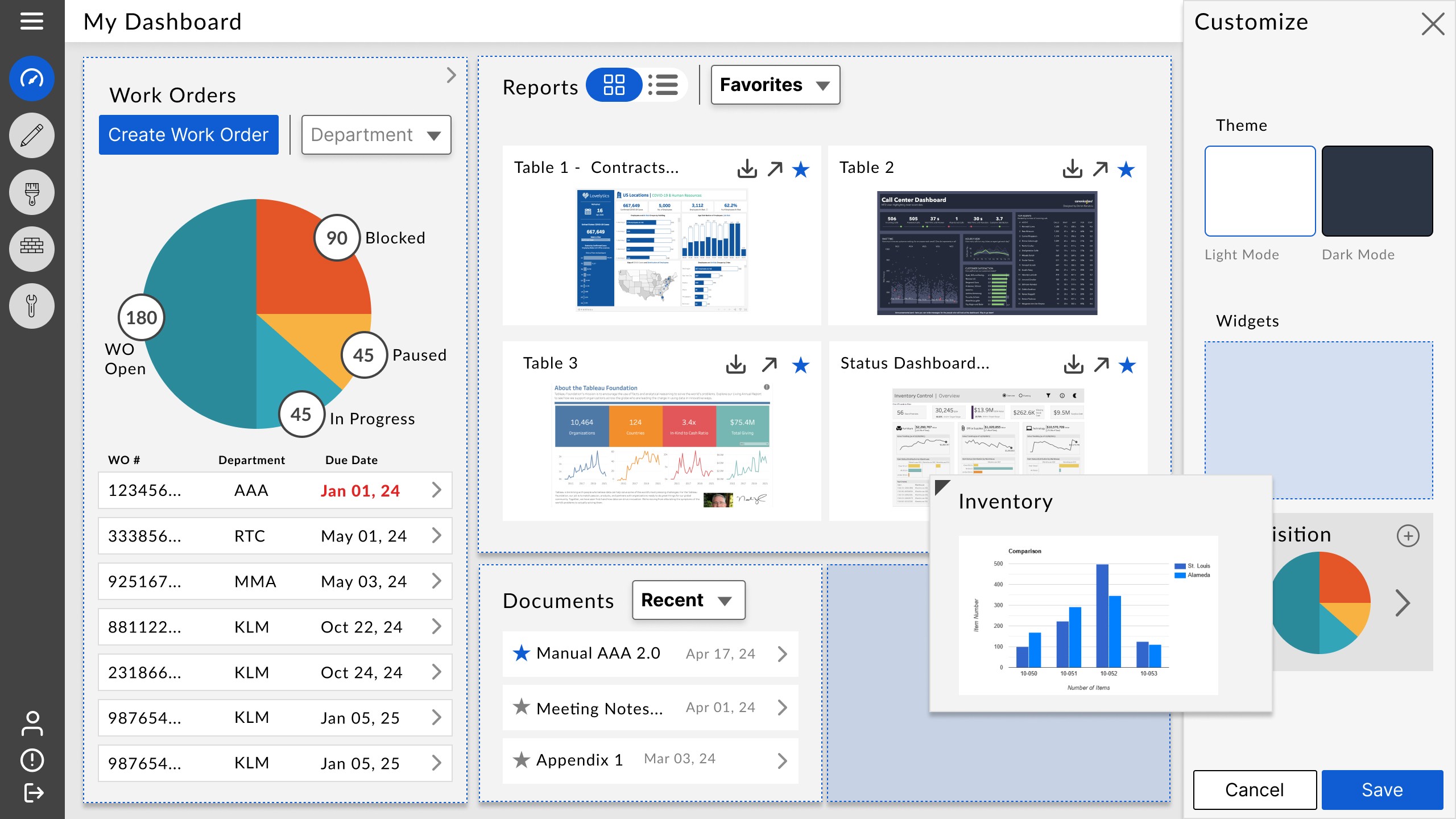
Redundant actions such as being able to drag-and-drop or use the 'add' button ensure accessible design
*These images are a recreation in compliance with my NDA
Premade widgets allow users to effortlessly customize
Each widget can be further edited to completely customize each view to the user's needs
✧ IMPACT ✧

