✧ PROCESS ✧
My Role
Principal UX designer for the TV experience
Timeframe
Completed in 5 Months
Deliverables
TV, Desktop, and Mobile designs for the user & companion Interfaces
Methods
User mapping. Heuristic evaluation. A/B Testing. "Wizard of Oz" prototype testing. 1:1 mixed-methods interviews.
✧ PROBLEM ✧
Frustrating to navigate and lacking necessary features for MVP
Based on the initial design, the team worked to improve the product and adapt the design to the US market.
Create a complete product ecosystem that interfaces with medical monitoring equipment
Increase not only medical compliance, but also mental & physical health outcomes
Create a successful design in order to gain more funding from their parent company, Commscope
✧ DISCOVERY ✧
Behind schedule and with very little to show for their time, effort, and money
The team identified key issues in the legacy interface and made a clear plan to address said issues going forward.
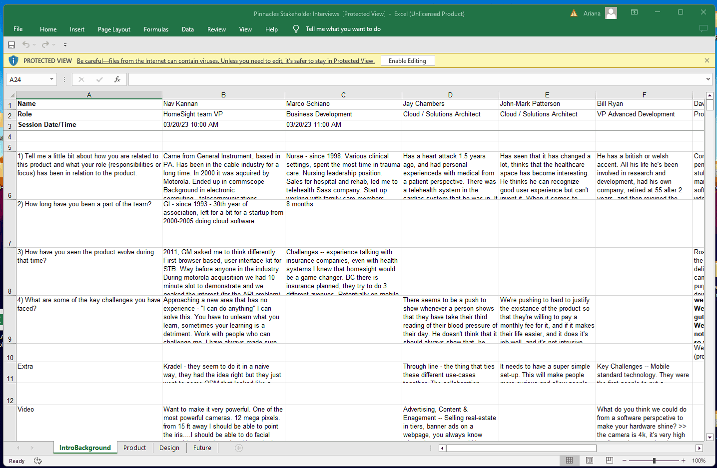
1:1 Stakeholders interviews ensured that we had a complete picture from every department of factors affecting business indicators.
Notes taken during our 1:1 stakeholder interview sessions
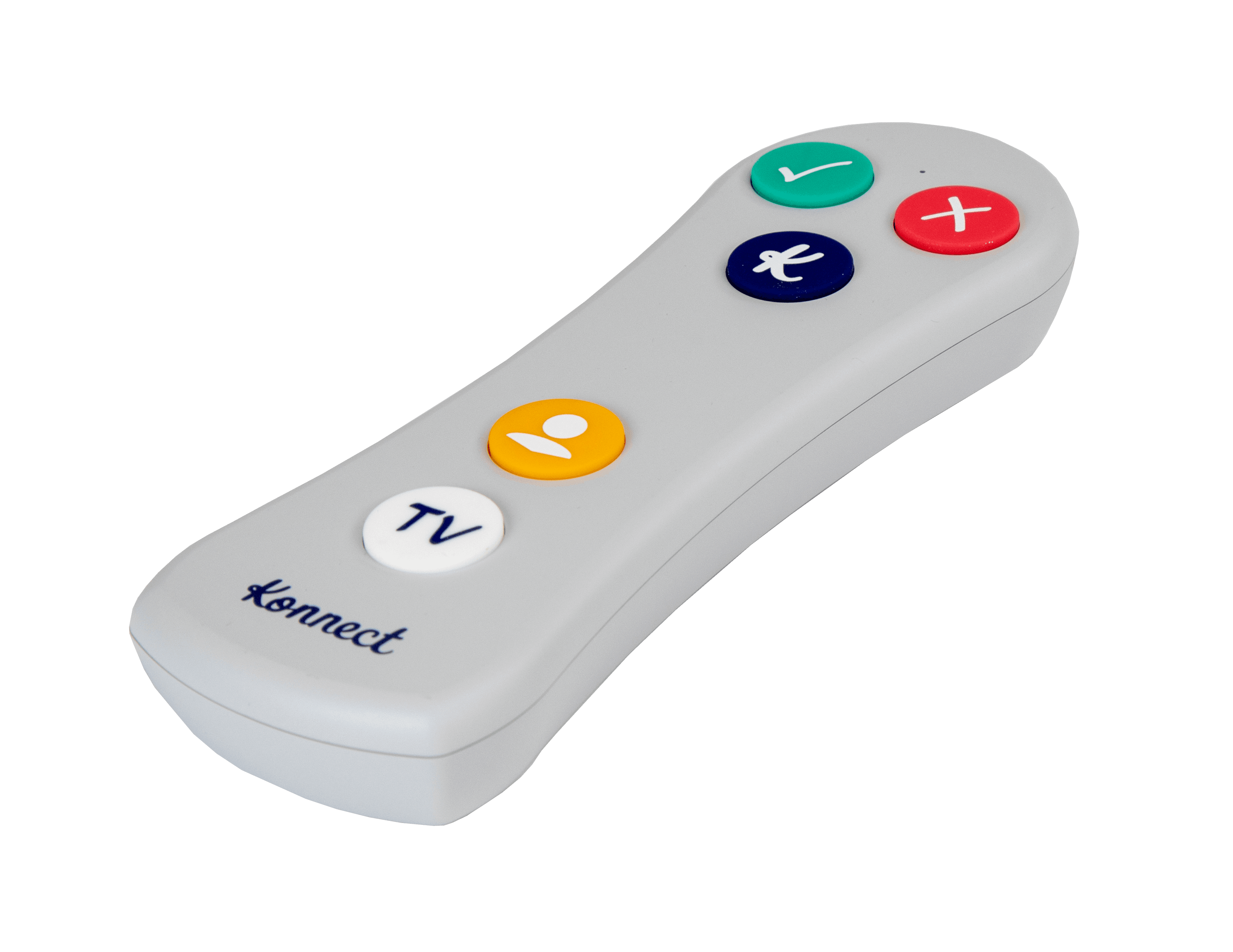
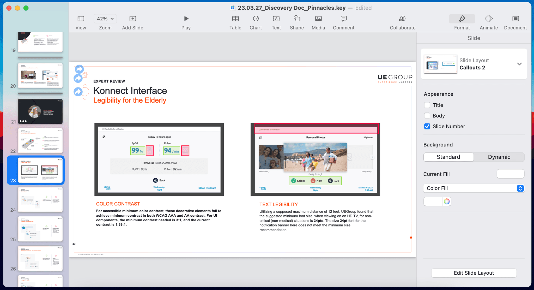
Through our Expert Review, the team identified key accessibility and usability issues with the generic interface and the 5-button remote hardware.
The discovery documentation & expert review deliverables, created in Keynote
Organizational infighting slowed the decision-making process
Legacy product was overly simplistic and missing key features for launch
5-button remote conflicted with user mental models
✧ IDEATION ✧
It was crucial initial concepts were easy-to-use and intuitive without making users feel infirm
The team applied UX design principles & principles of human psychology to address problems identified in the discovery phase.
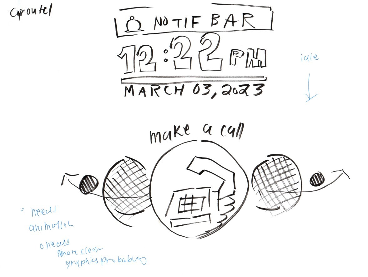
The team leveraged foundational findings and a range of sketched concepts to hone in on a direction.
Sketch of a concept that explored a carousel-like interface
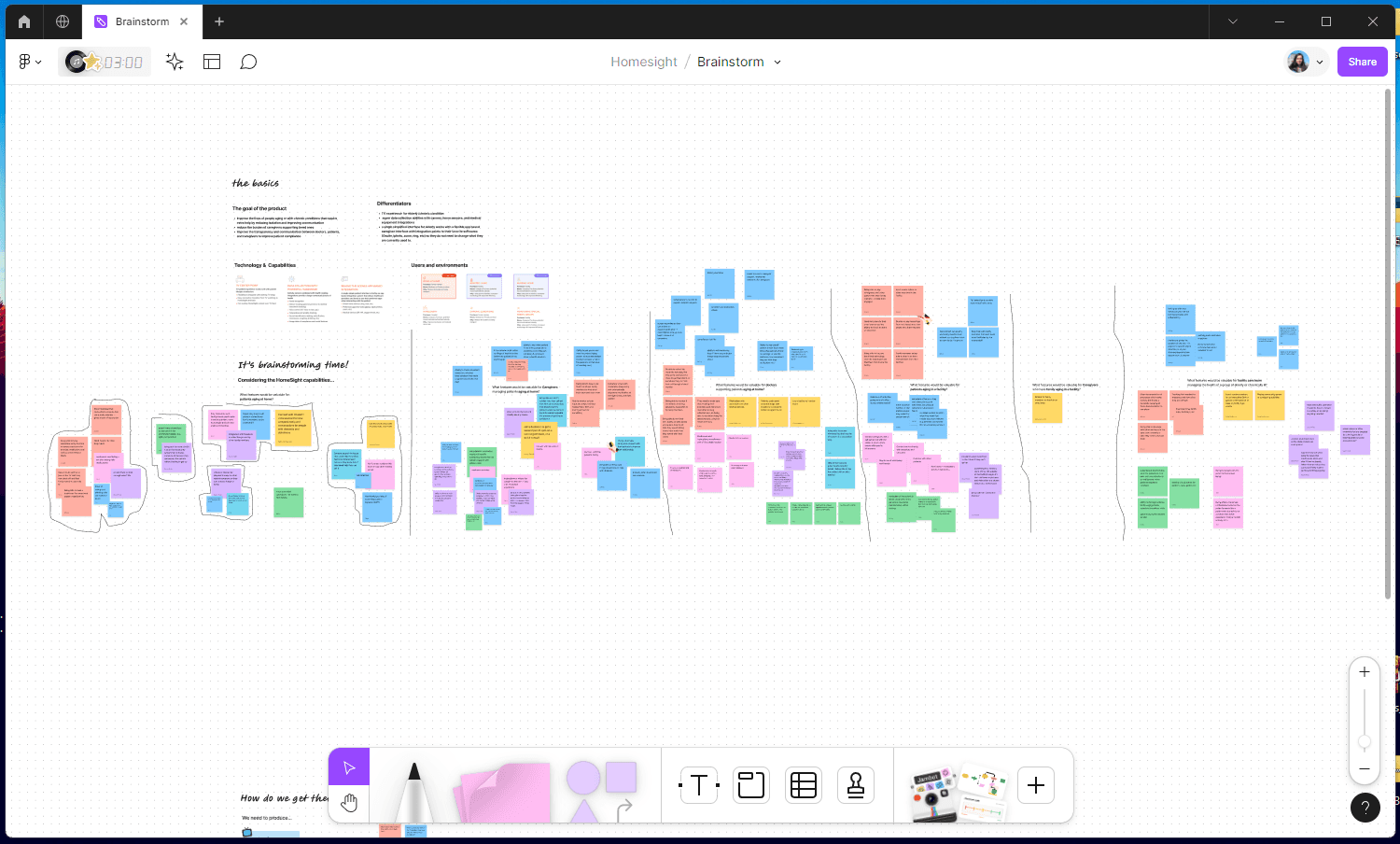
Cross-functional, interdisciplinary collaboration was key for complete ideation that explored different perspectives.
Brainstorming session conducted collaboratively in Figjam
Created two main concepts for stakeholders; One that was more customizable and one that was more guided.
Brainstormed possible features based on key personas and their needs within the system
Ensured concepts took into account age-related pain points
✧ INFORMATION ARCHITECTURE ✧
Creating an IA that was as simple as possible
The home page would allow users a place to always return to if they were to get disoriented.
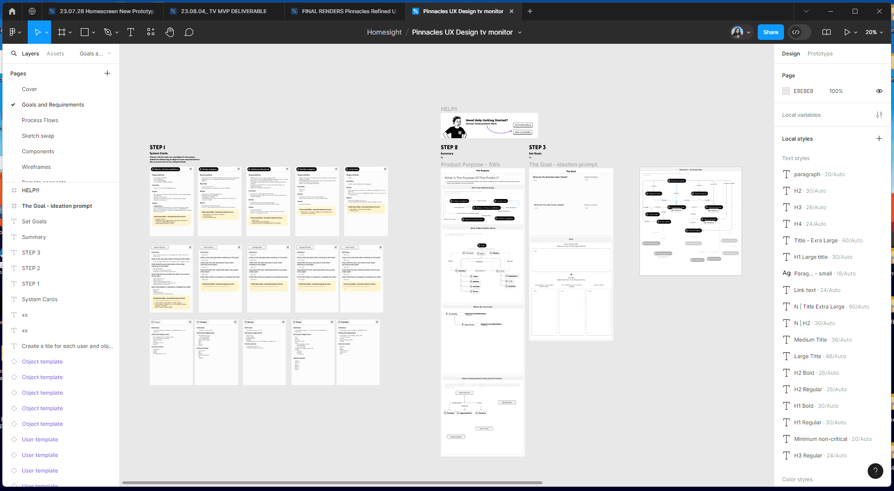
Creating detailed user models allowed the team to advocate for user needs while balancing business requirements.
Detailed user models help the team create an effective, yet simple IA
Maintained ease of navigation in the system while increasing complexity and features
Ensured that those with cognitive disabilities or impairments could also navigate the system
✧ RESEARCH ✧
Potential refinements to the initial design and featureset were gathered
The ideas and feedback from the A/B style testing were documented but ultimately were left out of the final deliverable due to budget cuts.
The team conducted 1:1 mixed method studies with those in the 65 to 85 age group, with special attention being given to those in the 75 to 85 subgroup.
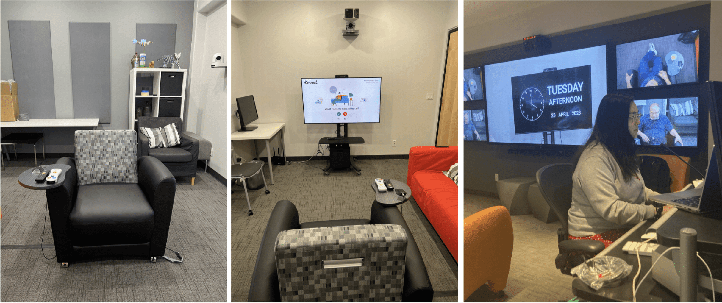
Research was conducted onsite in San Jose, California at the UEGroup research lab
While 8 out of the 11 participants preferred the new design, the remaining 3 voiced a want for a hybrid version, balancing functionality with simplicity.
The team conducted research with wireframes to remove aesthetic bias
Needed to continue to flesh out MVP features while still incorporating the simplicity of the Legacy system
✧ ITERATION ✧
Adapting to client budget cuts, the design team pivoted our approach and focused on the MVP
The final iteration fleshed out key non-negotiable features, but left out much of the medical functionality that was originally envisioned by the team.
Applying HCI and UX design principles ensured our design rationale was backed by human psychology and physiology.
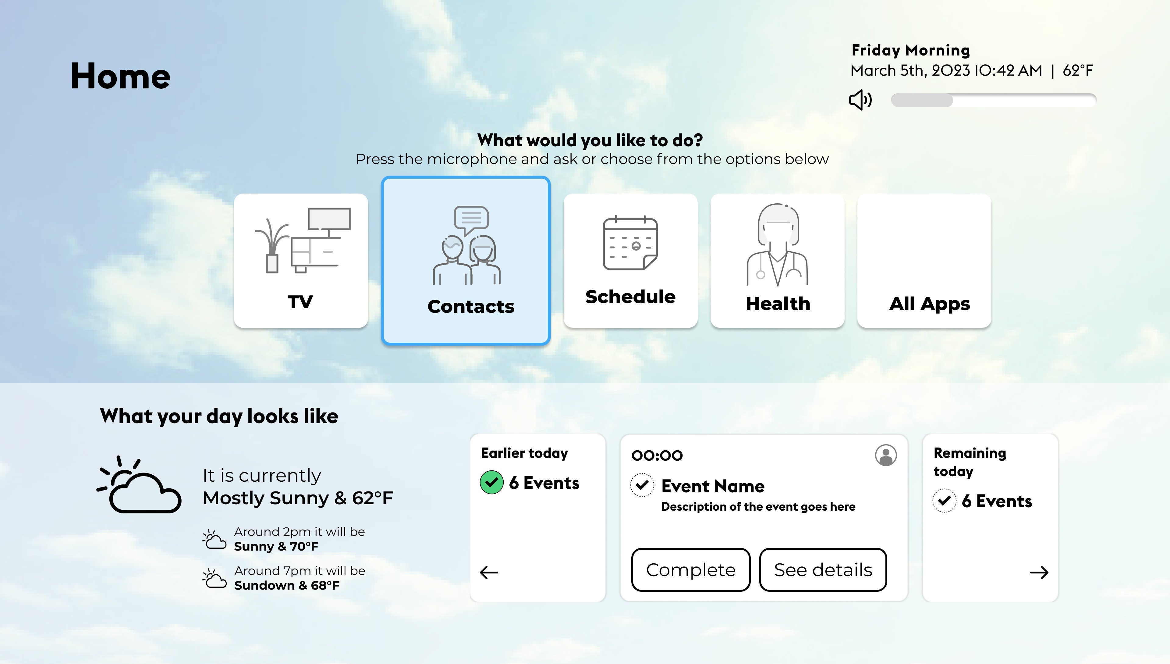
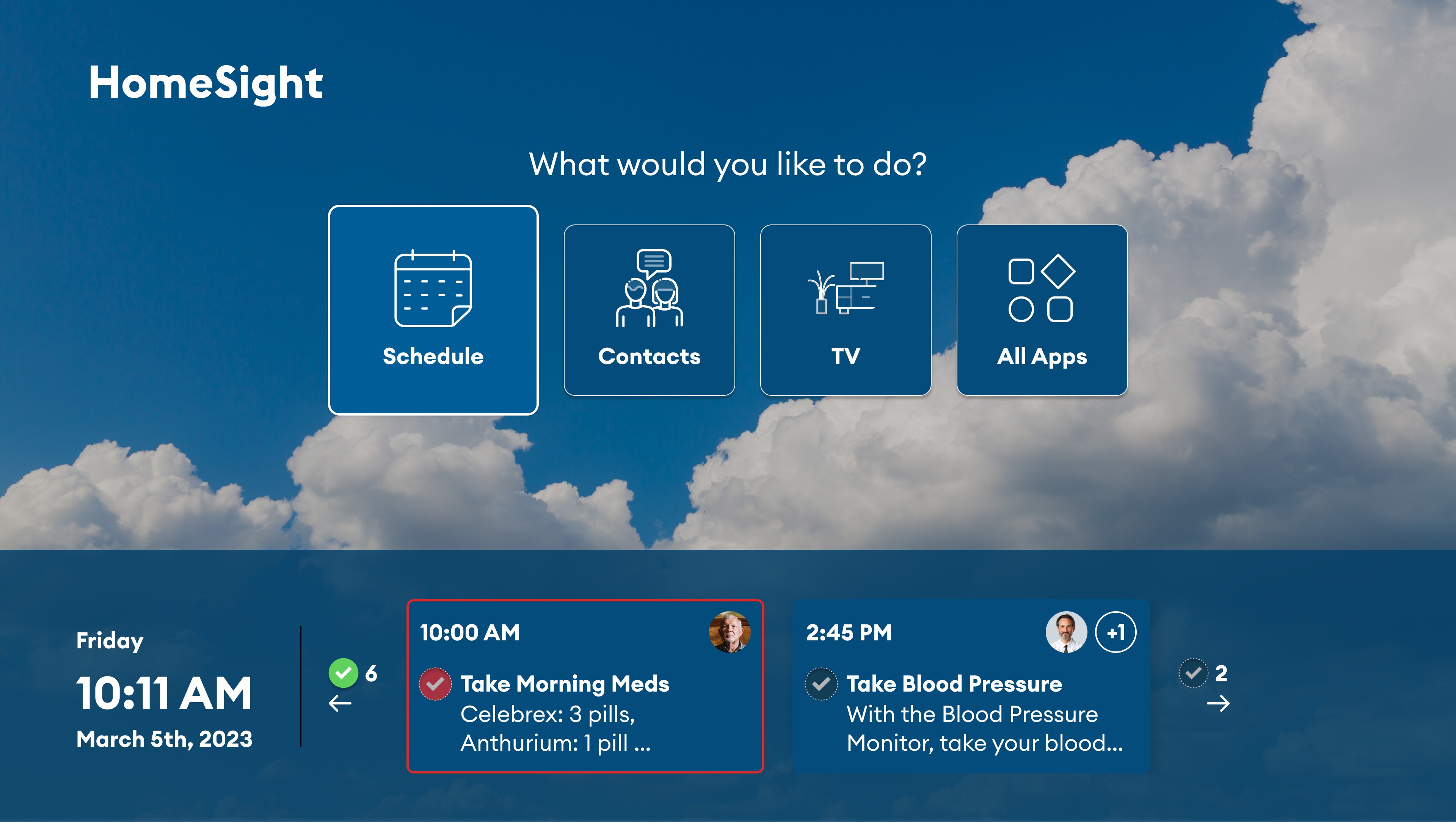
The final home screen design incorporated Homesight's branding
Components and assets were designed with the complete product development life cycle in mind to ensure scalability and flexibility for the client.
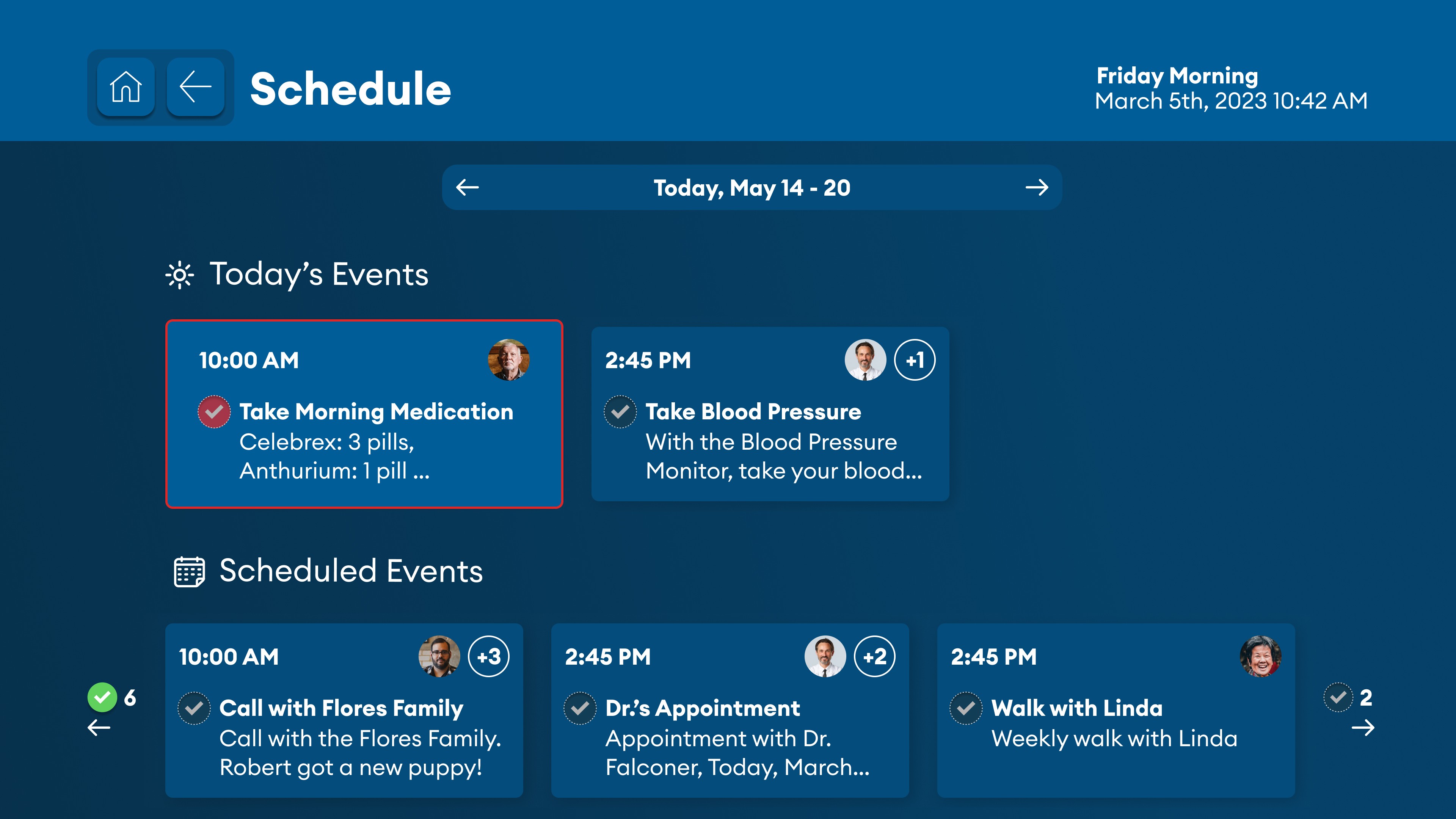
The scheduling page displays enough items to be useful without being overwhelming
Incorporating Homesight's branding, the new system has a unique, consistent look and feel
Surfacing key action items and reminders will help to increase medical compliance
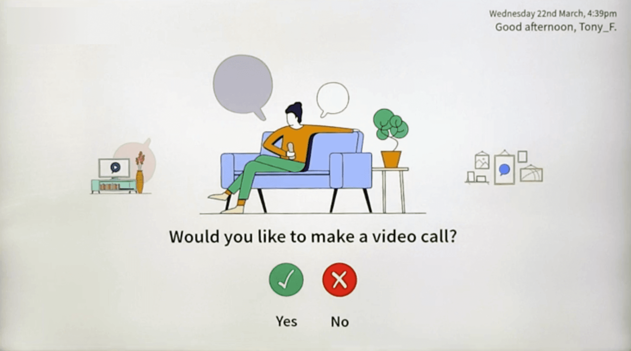
With a built-in calling system, elderly family aging in a retirement home can easily connect with their loved ones
✧ IMPACT ✧
A fast-paced learning experience for embracing ambiguity and taking initiative with the pivot to MVP
Next steps for the company were clearly outlined to help the client succeed in implementation outside of the contract, with
“We are really impressed … very clean, clear, and concise.”
— Nav Kannan, Homesight Team VP
The team recommended more usability testing and foundational research to become more familiar with users with special needs.
More features need to make the system more appealing to retirement homes, who could buy the systems in bulk.

